Visualizing Multidimensional Data in Python
Nearly everyone is familiar with two-dimensional plots, and most college students in the hard sciences are familiar with three dimensional plots. However, modern datasets are rarely two- or three-dimensional. In machine learning, it is commonplace to have dozens if not hundreds of dimensions, and even human-generated datasets can have a dozen or so dimensions. At the same time, visualization is an important first step in working with data. In this blog entry, I’ll explore how we can use Python to work with n-dimensional data, where $n\geq 4$.
Packages
I’m going to assume we have the numpy, pandas, matplotlib, and sklearn packages installed for Python. In particular, the components I will use are as below:
1import matplotlib.pyplot as plt
2import pandas as pd
3
4from sklearn.decomposition import PCA as sklearnPCA
5from sklearn.discriminant_analysis import LinearDiscriminantAnalysis as LDA
6from sklearn.datasets.samples_generator import make_blobs
7
8from pandas.tools.plotting import parallel_coordinates
Plotting 2D Data
Before dealing with multidimensional data, let’s see how a scatter plot works with two-dimensional data in Python.
First, we’ll generate some random 2D data using sklearn.samples_generator.make_blobs. We’ll create three classes of points and plot each class in a different color. After running the following code, we have datapoints in X, while classifications are in y.
1X, y = make_blobs(n_samples=200, centers=3, n_features=2, random_state=0)
To create a 2D scatter plot, we simply use the scatter function from matplotlib. Since we want each class to be a separate color, we use the c parameter to set the datapoint color according to the y (class) vector.
1plt.scatter(X[:,0], X[:,1], c=y)
2plt.show()
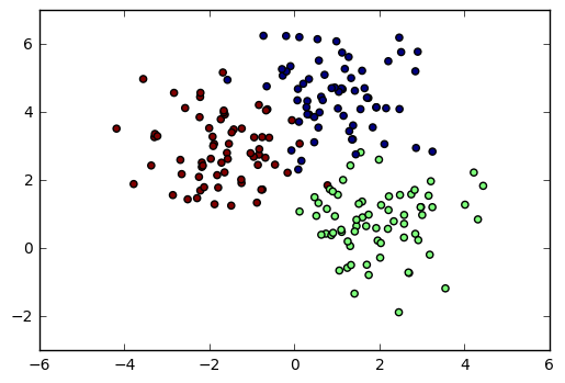
2D Scatter Plot with Colors
n-dimensional dataset: Wine
In the rest of this post, we will be working with the Wine dataset from the UCI Machine Learning Repository. I selected this dataset because it has three classes of points and a thirteen-dimensional feature set, yet is still fairly small.
1url = 'https://archive.ics.uci.edu/ml/machine-learning-databases/wine/wine.data'
2cols =  ['Class', 'Alcohol', 'MalicAcid', 'Ash', 'AlcalinityOfAsh', 'Magnesium', 'TotalPhenols',
3         'Flavanoids', 'NonflavanoidPhenols', 'Proanthocyanins', 'ColorIntensity',
4         'Hue', 'OD280/OD315', 'Proline']
5data = pd.read_csv(url, names=cols)
6
7y = data['Class']          # Split off classifications
8X = data.ix[:, 'Alcohol':] # Split off features
Method 1: Two-dimensional slices
A simple approach to visualizing multi-dimensional data is to select two (or three) dimensions and plot the data as seen in that plane. For example, I could plot the Flavanoids vs. Nonflavanoid Phenols plane as a two-dimensional “slice” of the original dataset:
 1# three different scatter series so the class labels in the legend are distinct
 2plt.scatter(X[y==1]['Flavanoids'], X[y==1]['NonflavanoidPhenols'], label='Class 1', c='red')
 3plt.scatter(X[y==2]['Flavanoids'], X[y==2]['NonflavanoidPhenols'], label='Class 2', c='blue')
 4plt.scatter(X[y==3]['Flavanoids'], X[y==3]['NonflavanoidPhenols'], label='Class 3', c='lightgreen')
 5
 6# Prettify the graph
 7plt.legend()
 8plt.xlabel('Flavanoids')
 9plt.ylabel('NonflavanoidPhenols')
10
11# display
12plt.show()
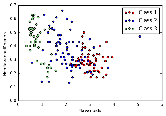
Cross-Section of Data scatter plot
The downside of this approach is that there are $\binom{n}{2} = \frac{n(n-1)}{2}$ such plots for $n$-dimensional an dataset, so viewing the entire dataset this way can be difficult. While this does provide an “exact” view of the data and can be a great way of emphasizing certain relationships, there are other techniques we can use. A related technique is to display a scatter plot matrix.
Feature Scaling
Before we go further, we should apply feature scaling to our dataset. In this example, I will simply rescale the data to a $[0,1]$ range, but it is also common to standardize the data to have a zero mean and unit standard deviation.
1X_norm = (X - X.min())/(X.max() - X.min())
Method 2: PCA Plotting
Principle Component Analysis (PCA) is a method of dimensionality reduction. It has applications far beyond visualization, but it can also be applied here. It uses eigenvalues and eigenvectors to find new axes on which the data is most spread out. From these new axes, we can choose those with the most extreme spreading and project onto this plane. (This is an extremely hand-wavy explanation; I recommend reading more formal explanations of this.)
In Python, we can use PCA by first fitting an sklearn PCA object to the normalized dataset, then looking at the transformed matrix.
1pca = sklearnPCA(n_components=2) #2-dimensional PCA
2transformed = pd.DataFrame(pca.fit_transform(X_norm))
The return value transformed is a samples-by-n_components matrix with the new axes, which we may now plot in the usual way.
1plt.scatter(transformed[y==1][0], transformed[y==1][1], label='Class 1', c='red')
2plt.scatter(transformed[y==2][0], transformed[y==2][1], label='Class 2', c='blue')
3plt.scatter(transformed[y==3][0], transformed[y==3][1], label='Class 3', c='lightgreen')
4
5plt.legend()
6plt.show()
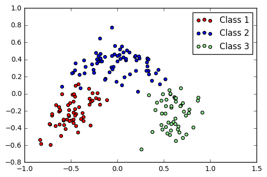
PCA plot of Wine dataset
A downside of PCA is that the axes no longer have meaning. Rather, they are just a projection that best “spreads” the data. However, it does show that the data naturally forms clusters in some way.
Method 3: Linear Discriminant Analysis
A similar approach to projecting to lower dimensions is Linear Discriminant Analysis (LDA). This is similar to PCA, but (at an intuitive level) attempts to separate the classes rather than just spread the entire dataset.
The code for this is similar to that for PCA:
 1lda = LDA(n_components=2) #2-dimensional LDA
 2lda_transformed = pd.DataFrame(lda.fit_transform(X_norm, y))
 3
 4# Plot all three series
 5plt.scatter(lda_transformed[y==1][0], lda_transformed[y==1][1], label='Class 1', c='red')
 6plt.scatter(lda_transformed[y==2][0], lda_transformed[y==2][1], label='Class 2', c='blue')
 7plt.scatter(lda_transformed[y==3][0], lda_transformed[y==3][1], label='Class 3', c='lightgreen')
 8
 9# Display legend and show plot
10plt.legend(loc=3)
11plt.show()
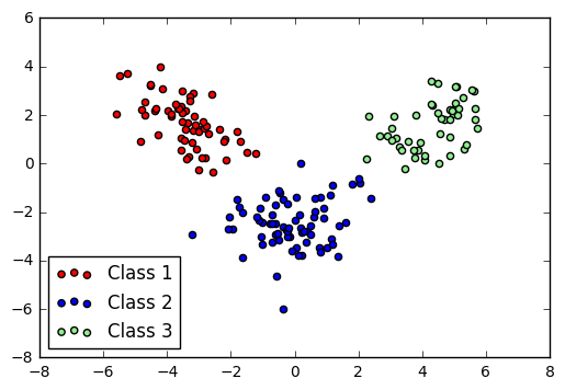
LDA plot of Wine dataset
Method 4: Parallel Coordinates
The final visualization technique I’m going to discuss is quite different than the others. Instead of projecting the data into a two-dimensional plane and plotting the projections, the Parallel Coordinates plot (imported from pandas instead of only matplotlib) displays a vertical axis for each feature you wish to plot. Each sample is then plotted as a color-coded line passing through the appropriate coordinate on each feature. While this doesn’t always show how the data can be separated into classes, it does reveal trends within a particular class. (For instance, in this example, we can see that Class 3 tends to have a very low OD280/OD315.)
1# Select features to include in the plot
2plot_feat = ['MalicAcid', 'Ash', 'OD280/OD315', 'Magnesium','TotalPhenols']
3
4# Concat classes with the normalized data
5data_norm = pd.concat([X_norm[plot_feat], y], axis=1)
6
7# Perform parallel coordinate plot
8parallel_coordinates(data_norm, 'Class')
9plt.show()
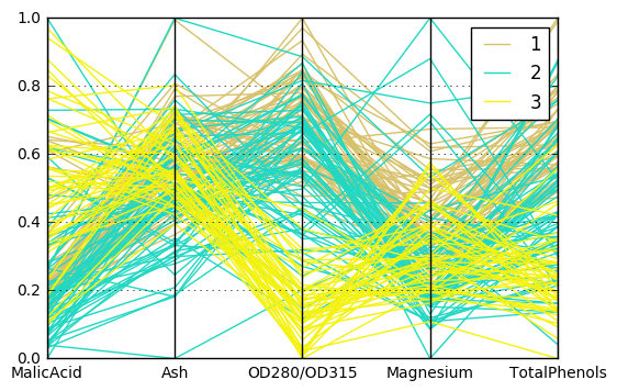
Parallel Coordinates Plot
Which do I use?
As with much of data science, the method you use here is dependent on your particular dataset and what information you are trying to extract from it. The PCA and LDA plots are useful for finding obvious cluster boundaries in the data, while a scatter plot matrix or parallel coordinate plot will show specific behavior of particular features in your dataset.
I drafted this in a Jupyter notebook; if you want a copy of the notebook or have concerns about my post for some reason, you can send me an email at apn4za on the virginia.edu domain.